Tuesday, December 29, 2009
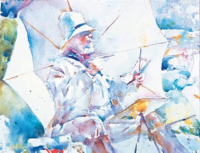
Charles Reid on Planning Lost and Found Edges

Monday, December 21, 2009
Late Renoir and American Painting Exhibits at LACMA
Two exhibits at LACMA (LA County Museum of Art) February 28th through May 9th, 2010.
Renoir in the 20th Century
February 14–May 9, 2010
Renoir in the 20th Century focuses on the last three decades of Renoir’s career, when, following his rupture with impressionism, he turned to an art that was decorative, classical, and informed by a highly personal interpretation of the Great Tradition. Renoir’s paintings from this period, which have never been studied and shown as such, are often misunderstood as they do not fit comfortably into the history of high modernism. This exhibition is the first monographic study dedicated to Renoir since the comprehensive retrospective of 1985 at the Galeries nationales du Grand Palais in Paris, and the first one ever mounted by the Los Angeles County Museum of Art. Offering an unprecedented look at Renoir through the lens of modernism, the exhibition bridges the divide that exists in many people’s minds between art of the nineteenth and the twentieth centuries
American Stories: Paintings of Everyday Life, 1765–1915
February 28–May 23, 2010
From the colonial period to the present, Americans have been inventing characters and plots, settings and situations to give meaning to our everyday lives. American Stories: Paintings of Everyday Life, 1765-1915includes seventy-five paintings, from before the Revolution to the start of World War I, that tell these stories in scenes of family life and courting, work and leisure, comic mishaps and disasters. These daily experiences were all subject to the artist’s searching and revealing eye and many of the works on view are famous images known to almost every American. Major artists such as Thomas Eakins and Winslow Homer, John Singleton Copley and George Caleb Bingham, John Singer Sargent and Mary Cassatt, are included in this important survey, the first of its kind in over thirty years.
Thursday, December 17, 2009
My Painting Students Get Some Ink!
"Local Artists Paint Bright Future"Tuesday, December 15, 2009By CARL LOVESpecial to the Press-Enterprise'Are you related to Ralph Love?"
It's a question I hadn't heard in at least five years, but I heard it twice in one night on Saturday. It must have meant I was around artists, a rare treat in these parts.
Love -- him, not me -- was Temecula's most famous artist. There is the Ralph Love Plein Air Festival held in Old Town Temecula, but artists here are focusing on the Temecula Valley Art League's open house for its gallery at 41789 Nicole Lane.
Eighteen league members have about 100 paintings on display on the walls of the front room. It's one of a few local galleries, a sad commentary for an area that's become so urban.
Temecula fancies itself as a destination with its Wine Country, Old Town and balloon festival. Yet our shortage of galleries is not what you'd expect from a place that's trying to be sophisticated.
Doing its part to change that is the Art League, founded as a nonprofit in 1977 by Mary Davis, who was there Saturday.
This is the first time the group has had a permanent home, about 1,600 square feet to hold its monthly meetings, display art, conduct classes, host shows, and serve as a gathering place for artists.
One art teacher, Mary Mulvihill, said four of her students -- Adria Di Maria, Jennifer Morlan, June Kakowski and Tim Russell -- have work displayed here.
"There is something exciting about being in a gallery," she says.
Works in the front room included lots of flowers, animals, a few western scenes and some snow and beach paintings. Yet it was hard to find anything local from our Wine Country, Old Town, balloon festival, agriculture heritage and trademark subdivisions.
"We are lagging" in paintings of local scenes, Mulvihill says. So much so that Japanese tourists who visited recently had to be referred to Temecula City Hall, where works featuring local scenes can be found.
"If anybody is going to do it (create art of local things), we're going to do it," Mulvihill says.
Nobody knows better than Davis, an artist who won the community citizen of the year award in 1972. She also took lessons from Love, who she says worked in a room that was all black. An ordained minister, she said at times he also gave sermons while painting. You know artists; they can have their quirks.
"He was very religious, very quiet," she says. "What he said was the word."
Love, who owned a studio called the Art Shack, sold paintings for a fundraiser to get the art league up and running. She bought some paintings and is willing to display them at the new gallery.
"They are kind of priceless," she says.
No doubt he would have enjoyed the new space, which has almost tripled the Art League's membership since it opened. Membership is $30 a year and President Carol Landry, at 951-303-8100, has more information.
Landry has big plans for the Art League's new space, staffed by volunteers. Art walks and juried shows are held every month. A western wildlife art show is planned in May.
Bea Taylor is one local artist thrilled to have a spot to display her work.
"After 32 years we finally have a permanent place to show our art," she says. "It's wonderful that I can share my work."
Besides her art in the front room, Taylor also has her paintings displayed in the back rooms, including two in the restroom.
"I don't mind," she says happily.
When it comes to a permanent place to show their work after all these years of wandering, local artists aren't about to be picky.
Reach Carl Love at carllove4@yahoo.com.
Sunday, December 6, 2009
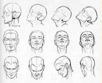
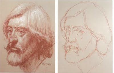
Reference Material for Drawing the Head


Thursday, December 3, 2009
December Syllabus Wednesday Painting Class - Colored Blocks
Photographing Your Artwork
Authenticity - from Art Marketing Secrets
We have been talking in class about sincerity in our art and to paint what you are passionate about. This fits right in!
"The topic of authenticity has been in our attention a lot at Art Marketing Secrets lately. It started with an innocent discussion about why some art feels like decoration and other art truly feels like art. And what is art really anyway?
Well – we could all sit around debating that last point until the cows and the pink elephants come home, but the question of real art vs. decoration and why is one which doesn’t go away.
My opinion is that it’s all about authenticity. It explains to me why it’s possible to have a technically perfect piece of art that leaves me feeling nothing and yet sometimes I see a work that exhilarates me but is lacking in a mastery of the craft. It also explains why some artists can create a truly great piece of art with just a single stroke of a pencil or a few brushstrokes of paint apparently applied quite haphazardly.
Indulge me and I’ll give you my personal view on authenticity. And I didn’t study psychology so be warned!
I think each one of us has a chariot and a team of very powerful horses – just like Charlton Heston’s character in “Ben Hur”. Each of the horses represents a different aspect of our nature and our dreams.
- Our subconscious program which is often operating on very basic thought processes like survival and pleasure or what our parents or teachers wanted for us.
- Our conscious thoughts which can be very focused or scattered like autumn leaves.
- Our emotions which run independently and explore the whole spectrum of pleasure and pain, sometimes from moment to moment.
- Our physical reality where we are challenged with learning and mastering the actual techniques that can translate all the impulses from those other parts of us onto the canvas or into the clay or glass or metal we work with.
And then, beyond all that noise, standing in our chariot, very calm in the midst of this vortex of experience and activity is the true us – the dreamer of the dream. We had a plan and a purpose for this race but what was it?
Will we remember and take charge of the horses and run the best race? Or will we stay half conscious and let every horse run in its own direction and rip the chariot apart?
When we connect with our true dreams and purpose and master the incredibly powerful team of horses pulling our chariot we launch forth at maximum speed into a zone where anything is possible and our dreams can pour forth freely into our work.
Its a recipe for creating great art or a true dream or a true life.
What does this have to do with selling art? People can sense authenticity a mile away. It is such a powerful thing to see the work of a person who is truly aligned in their purpose and efforts. Like a big electromagnet, it can attract exactly the right people who will love and purchase your work – if that is your dream.
But all of this is just my thought. What do you think?"
Monday, November 9, 2009
The Rule of Thirds
From The Little Mermaid. I was noticing the focal point, the mouth of the cave is exactly at the intersection of thirds. Why is this a timeless rule. Any focal point at the intersection of thirds will NEVER cut the picture in half. There is either more above or below and more to the right or left. Never the same. By using values the background also uses an "O" composition. Dark at the edges getting lighter until the focal point which is the darkest dark next to the lightest light.
Friday, November 6, 2009
Drawing Marilyn Monroe - Jason Baalman
Thursday, November 5, 2009
Rhythms in Drawing
Animators are trained to draw with rhythms, like we were talking about yesterday with your horse's legs. Look at the rhythm lines of Rafiki ... from arm to arm, leg to leg, torso flowing into the leg. Whatever you are drawing look for a rhythm line and then build onto or cut into it to move it from generic to specific. But start with the rhythm.
By:Walt Disney Animation Studios Look at the circular rhythm created by Rafiki's two arms. If you get that rhythm right you will be able to place the details correctly. Rhythms are everywhere. There are rhythms in the lion's face from one eye across to the other, from one eybrow across to the other ...
By:Walt Disney Animation Studios The rhythm of Rafiki's left arm is a simple "v". Then the details of the fur are added to it. But, it is a specific "v". Is it a wide or narrow "v" ... you can accurately see what kind of "v" it is if you ask it of yourself. If you look, you can see when it is off. The two questions you ask about shape are ... is it taller or narrower, is it wider or narrower? Ask about a line ... what is the angle? You know the angle of the 60 stops a minute hand makes as it goes around a clock face, so you know the angle of a line, of Rafiki's forearm. You know it!
Tuesday, November 3, 2009
Value Shapes
Standard Mat Sizes
Sunday, November 1, 2009
Saturday, October 24, 2009
Basic Watercolor Palette for Tuesday Afternoon Class
- Bismuth Yellow PY184 or Benzamida Yellow PY175 - cool yellow (Lemon Yellow)
- Hansa Yellow Medium PY97 - warm yellow (Golden Yellow)
- Perinone Orange PO43 - warm red (Cadmium Red Light)
- Anthraquinoid Red PR177 - cool red (Alizarin Crimson)
- French Ultramarine PB29 - cool blue (Ultramarine Blue)
- Phthalo Turquoise PB16 - warm blue (Turquoise)
- Viridian PG18 - cool green (Viridian)
- Raw Sienna PBr7 (Raw Sienna)
- Burnt Sienna PBr7 (Burnt Sienna)
- Burnt Umber PBr7 (Burnt Umber)
- Cobalt Blue PB28 - true blue with low tinting strength, good for glazing (Cobalt Blue Hue)
- Quinacridone Rose PV19 - high tinting strength cool red, good for florals (Thalo Crimson)
- Phthalo Blue PB15 - high tinting strength cool blue, good for mixing darks (Thalo Blue)
- Phthalo Green PG7 - high tinting strength cool green, good for mixing darks (Thalo Green)
- Quinacridone Red PR209 - true red (Grumbacher Red)
Tuesday, October 13, 2009
Twitter Links and Marketing Art
October Syllabus for the Drawing Class
The Drawing Class Takes the Contour Challenge!
Drawing is seeing. If you understand what you see, with practice you will be able to draw it. Contour drawing will develop eye to hand coordination. Just like learning a tennis serve, it will take practice, practice, and more practice.
A contour line explores the perimeter of a shape. It is not exactly the same as the outline or silhouette, but it may include those. Move your finger along the outside edge of the fingers on your other hand. Trace around a knuckle. You are moving your finger along the contours of the opposite hand. Contour drawing does the same thing, but instead of using your finger to feel the contour, you follow the contour with your eye and imagine your pencil on the paper is doing the same thing. With practice, what your eye sees, your hand will draw.
In blind contour drawing, look constantly at the object and never at the paper. Think … my eye moved this distance, my pencil moves the same distance. If you find it impossible to not look at your paper, throw a towel over the paper and your drawing hand, or put your drawing board on your lap under the table, where you cannot see it. Do not look at the paper until you have completely finished the drawing. Don’t worry if you lose your place. Keep focusing on what you see and letting your pencil follow. Go very slowly. Imagine your pencil and not your eye is moving along the object. The finished drawing will be out of proportion with every detail exaggerated. Good! The object of the exercise is to practice seeing. It doesn’t matter what the result it.
Contour drawing is the same as blind contour, except that you look at the paper to check the position of the pencil, the size of something or the direction of a line. But, NEVER draw while looking at the paper. When your pencil is moving, your eyes should be on the object. When you stop to check something and make a correction, your mind will remember. Your eye, hand and mind are learning to work together. Concentrate, but don’t feel any pressure about the result.


